Usability, Easy to Use, Intuitive, Learnable – What does this all mean, anyway?
By Gina Donlin, User Centric Design Engineer
When I think of a product or interface as truly “easy to use”, the first thought that comes to mind is “intuitive”; it shouldn’t require great labor or effort to use. You’d be able to swiftly navigate through computer interfaces, intuitively know how to use certain product features and simply get the job done quickly, moving right on to the next thing in your busy day. Sounds simple enough, right? Describing what usability means is actually a lot harder than it looks.
At Pearson, we take the approach of Whitney Quesenbery, who poses five questions to help us understand and assess usability:
- Is it Effective – Can the user complete the task?
- Is it Efficient – How long does it take them?
- How Engaging is the experience – Is the interface pleasant and satisfying to use?
- Is the interface Error Tolerant – Problems do happen sometimes. How does the system respond? How is it designed to prevent them from happening?
- Is it Easy to Learn – How intuitive is the system for new users? After the initial learning, can users continue to pick up on more advanced features?
Measuring Usability
Simply having a good understanding of usability, however, doesn’t automatically result in easy-to-use products. And how do we measure ease of use, anyway? After all, I am an engineer – I need proof, hard data.
With my background in Human Centered Design and Engineering, I set out to develop a scientific test environment and repeatable process to heuristically study human-machine interaction. But first things first, new to the world of packaging I needed to spend time talking with customers to learn about the job of a machine operator. I wanted to know what operators are responsible for during a shift, what their background, skills, and limitations are, as well as their biggest pain points in working with machines as they are today. I also learned what companies look for when hiring new operators and maintenance technicians so that I, too, could recruit some as representative participants for my study.
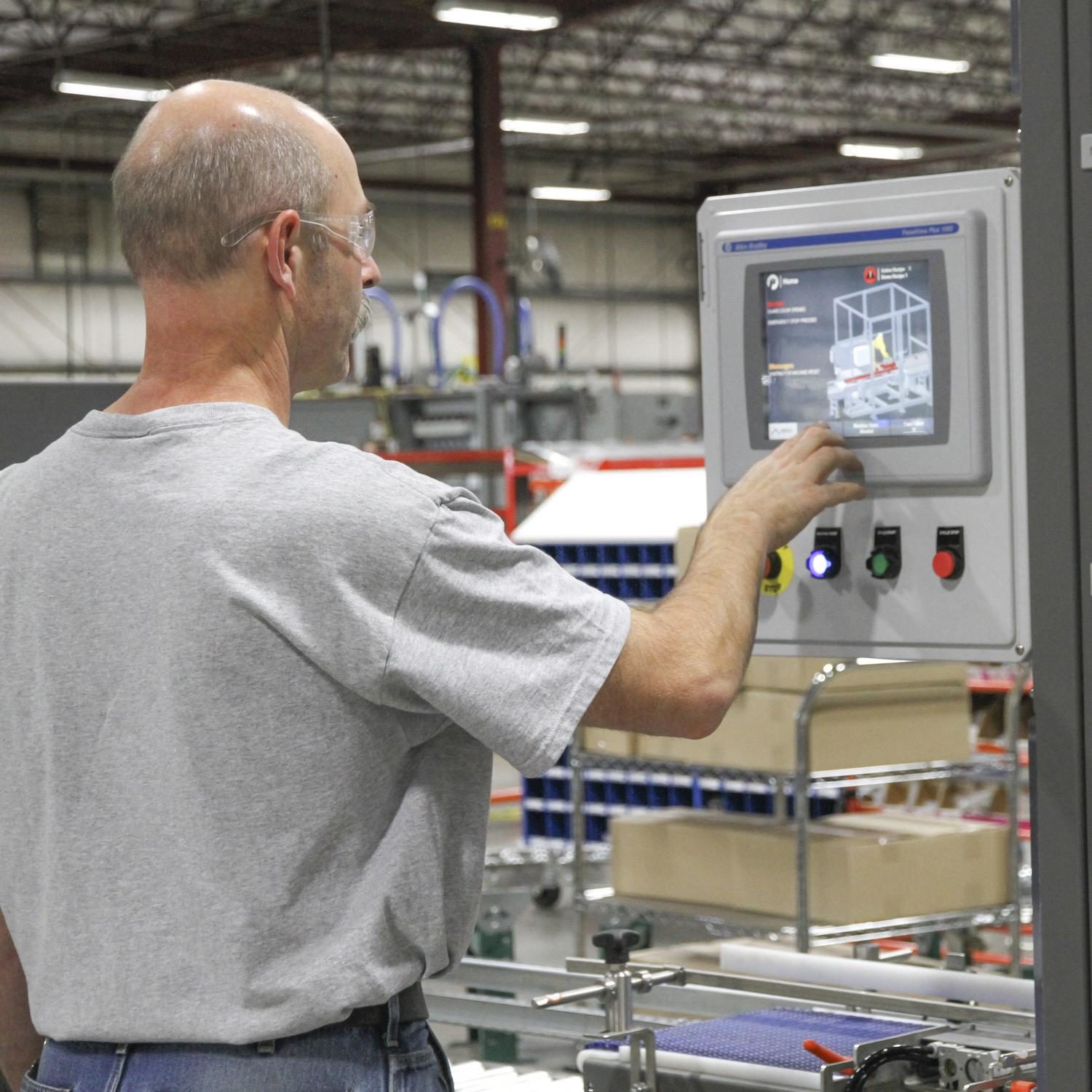
We brought in a mix of qualified operators, some of whom had never used Pearson equipment before – I labeled them novice users, and maintenance technicians with at least five years on the job – my expert group. A CS25 Case Sealer was the object of our usability study and data points were going to be derived from every-day key operator tasks: changeover and fault recovery.

The concept of our usability study revolved around answering the 5 E’s:
Effective – Determining operator success rate for the two tasks at hand
Efficient – Determining completion time for changeover and identifying what triggered the alarm
Engaging – Determining satisfaction with the experience through a standardized questionnaire
Error Tolerance – Determining amount of operator errors during the process and finding ways to prevent them in the future
Easy to Learn – Determining the level of effort exerted in learning a new machine and HMI through another standardized post-task questionnaire
Beyond observation, the study also used contextual inquiry, which basically means that I asked participants to literally speak their mind. What are they thinking as they are trying to navigate the computer interface? What questions come up during each step of the task? When does the “Aha” moment set in? Which complaints are muttered under their breath? – I want to know it all!
After we set up our CS25 Case Sealer with a test version of the new HMI and changed physical components, operators arrived for their one-hour session completing two changeovers and identifying three alarm situations. It was interesting to see all the different approaches they took to navigate through a new piece of equipment and to find what triggered the alarm.
What did we learn?
First and foremost we observed a 100% success rate for changeovers! After a brief orientation, all operators were able to complete changeovers on their own. – Effective? Check!
It took even novice operators just under 5 minutes to complete changeover on the CS25– Efficient? Check!
The usability questionnaire employed by us is commonly used for similar tests, which allowed us to benchmark our scores against a wide variety of test scenarios on a grading scale. The CS25 Case Sealer scored an A-. – Engaging? Check!
We found that operator errors were focusing on one specific area during the changeover task, which we sent to our engineers to fix right away. – Error Tolerant? Soon to be Check!
Users particularly liked the arrows on the screen pointing to the fault location, which made fault recovery much more intuitive. They knew right where to go to find the problem. Easy to learn? Check!
While the results were strong, the study also revealed several areas for improvement. Being able to more or less read people’s mind is a powerful thing! There are several opportunities for changes to further improve the operator experience. So stay tuned for Pearson’s future UCD releases 2.0, 3.0, 4.0 …. As technology changes, so do operator needs. User Centric Design is a never ending process, one that we at Pearson put at the core of our product design and lifecycle management.
